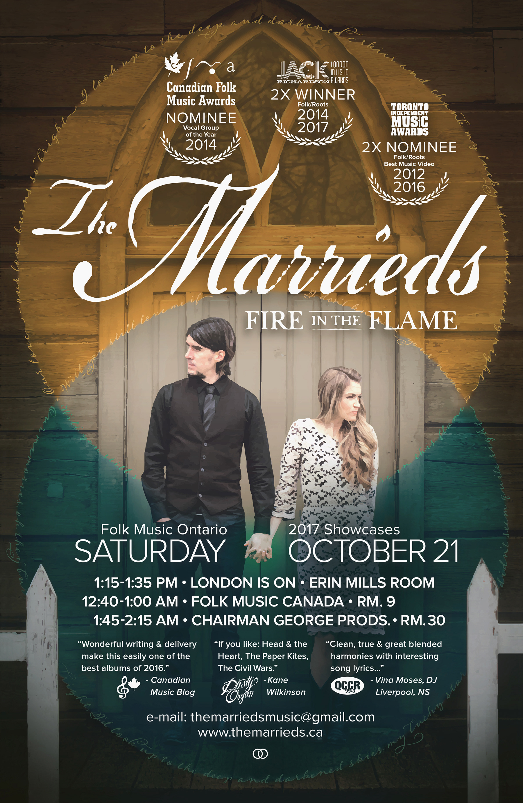
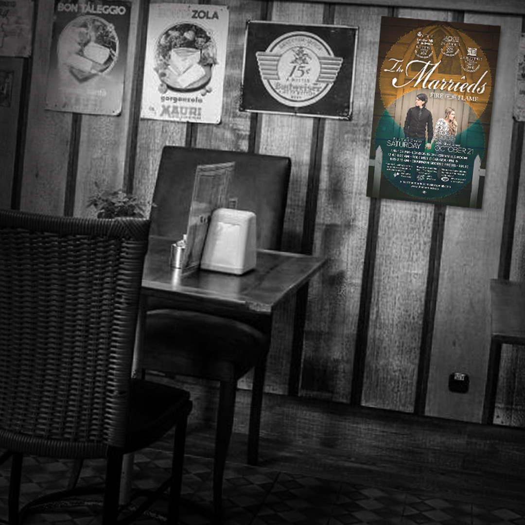
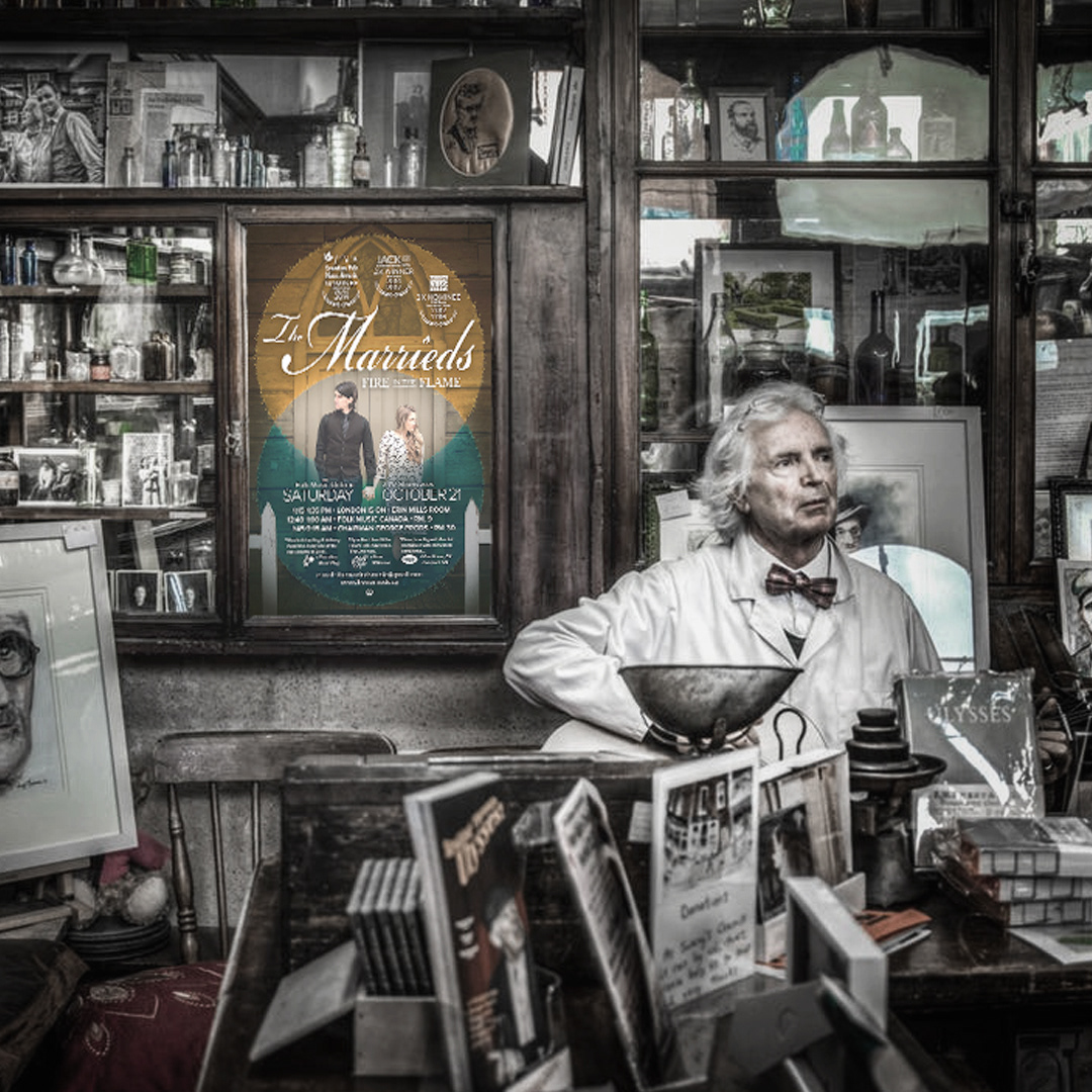
The brief seemed fairly simple, and yet it posed quite a challenge: Design a poster clearly communicating a schedule of showcase events, using existing materials, featuring accolades, reviews and other supporting information. BUT - design it so that it stands out amongst a sea of 100+ other artisit's posters, all of whom are trying to do the same thing: grab the attention of conference attendees and industry professionals.
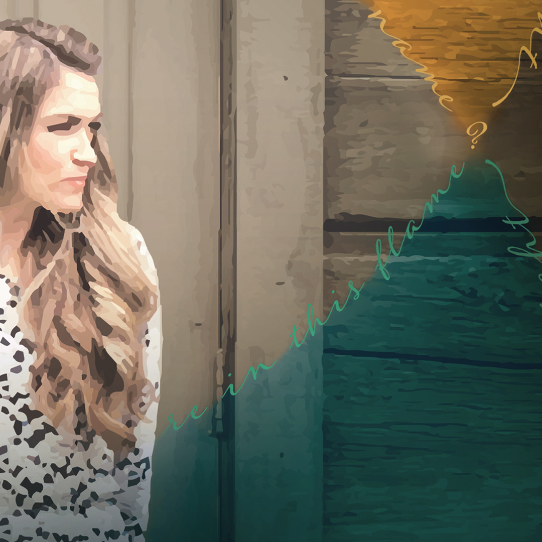
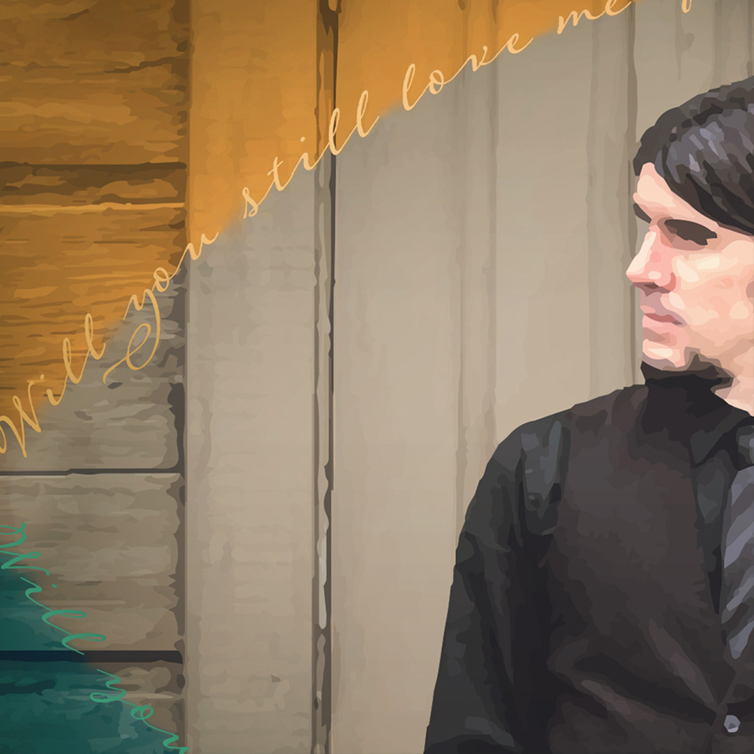
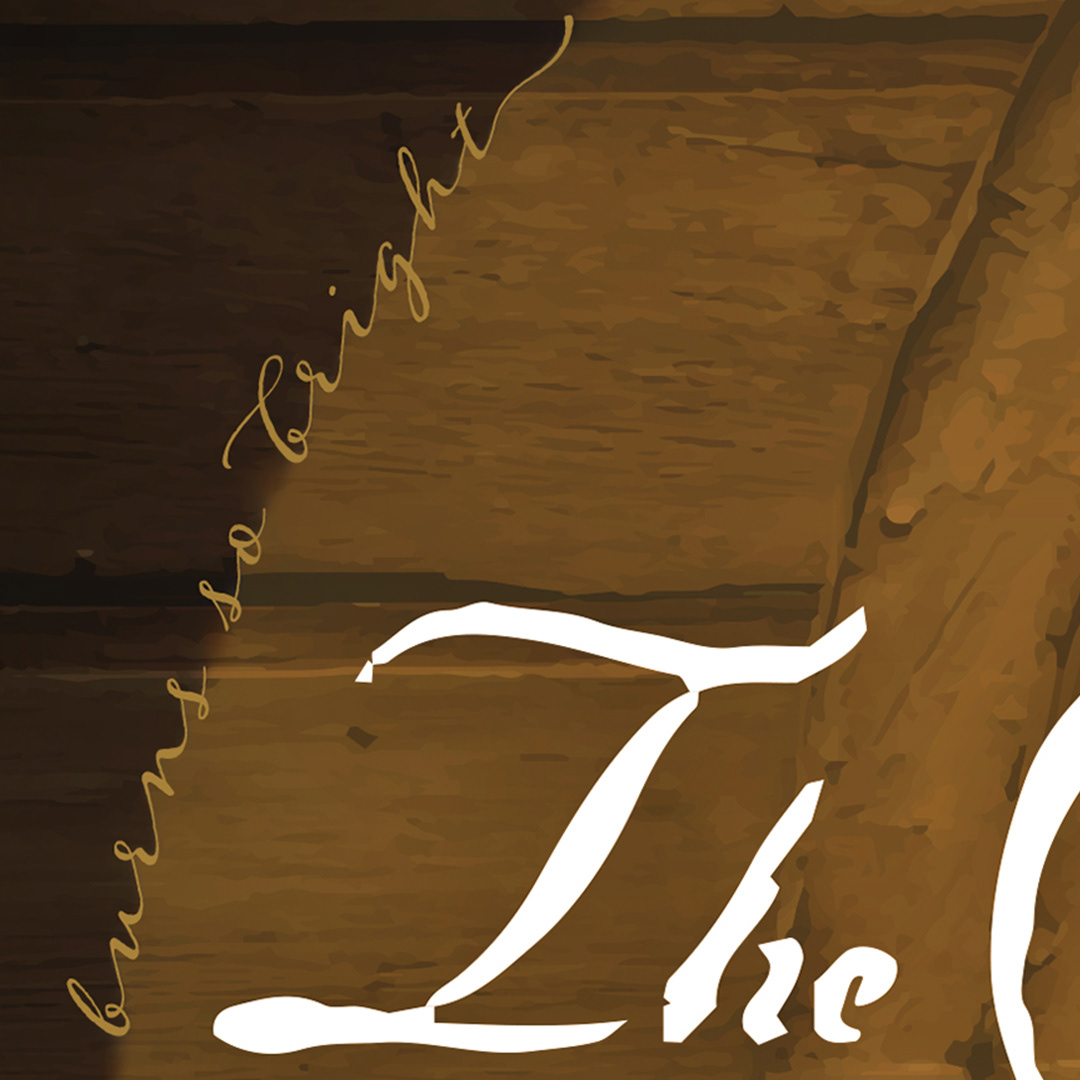
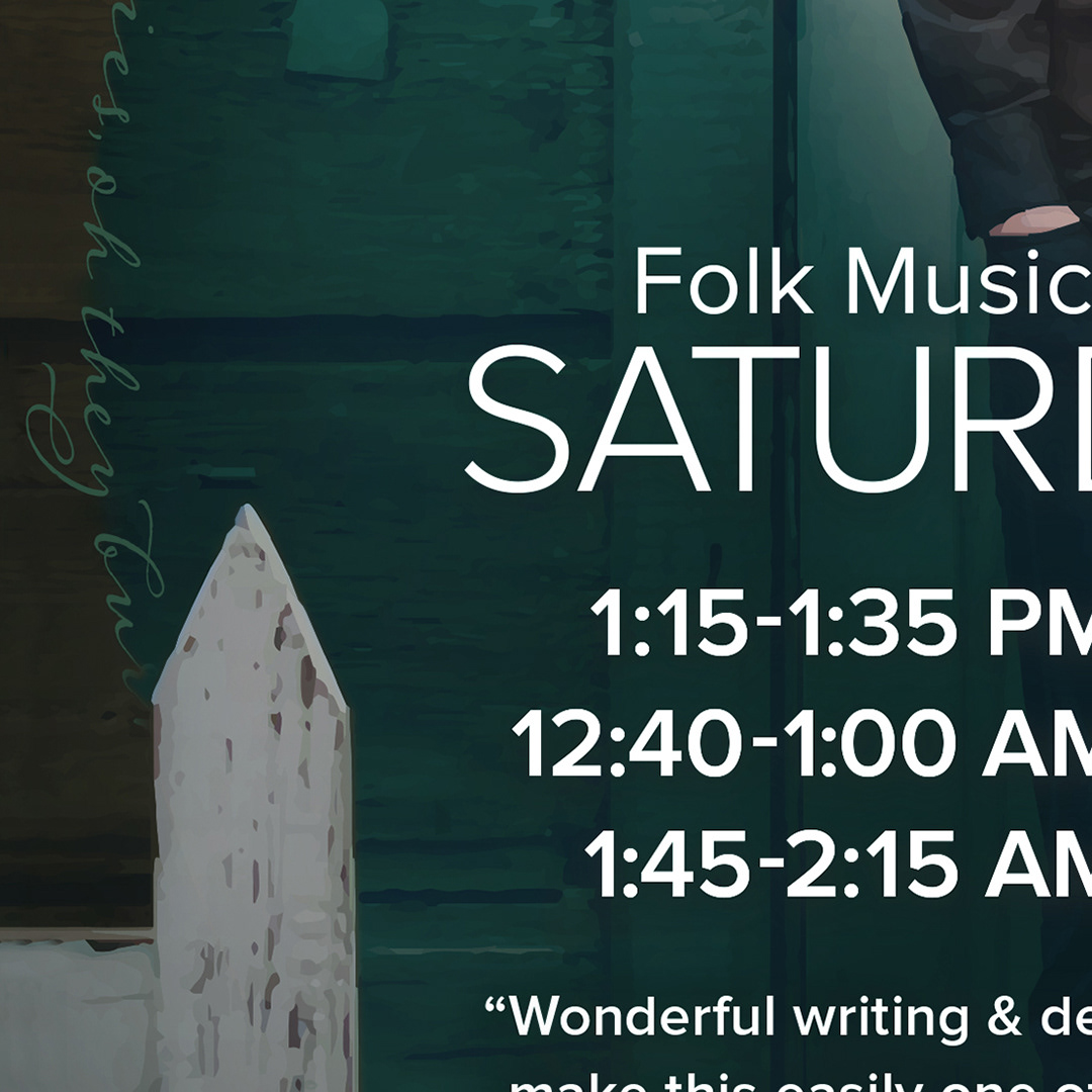
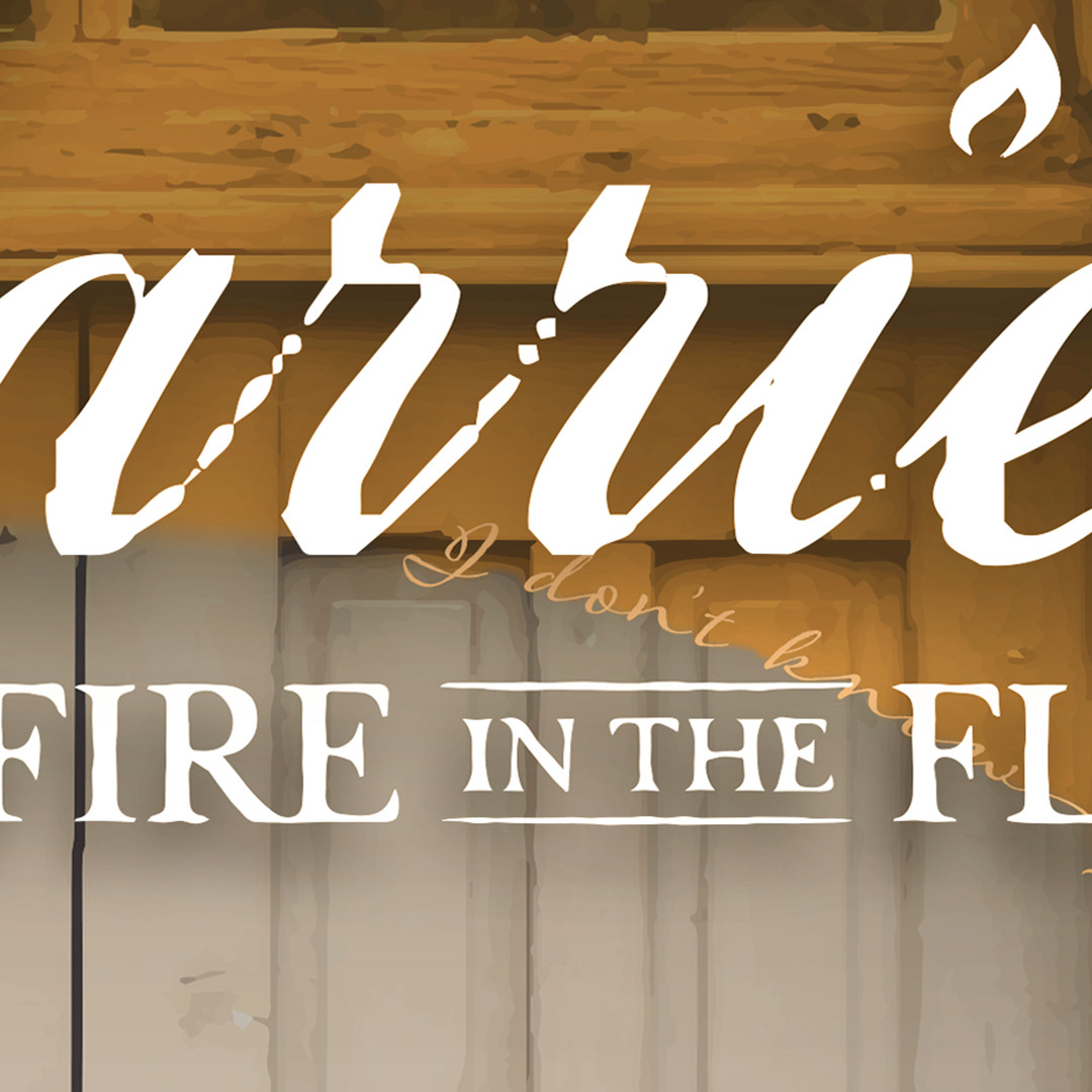
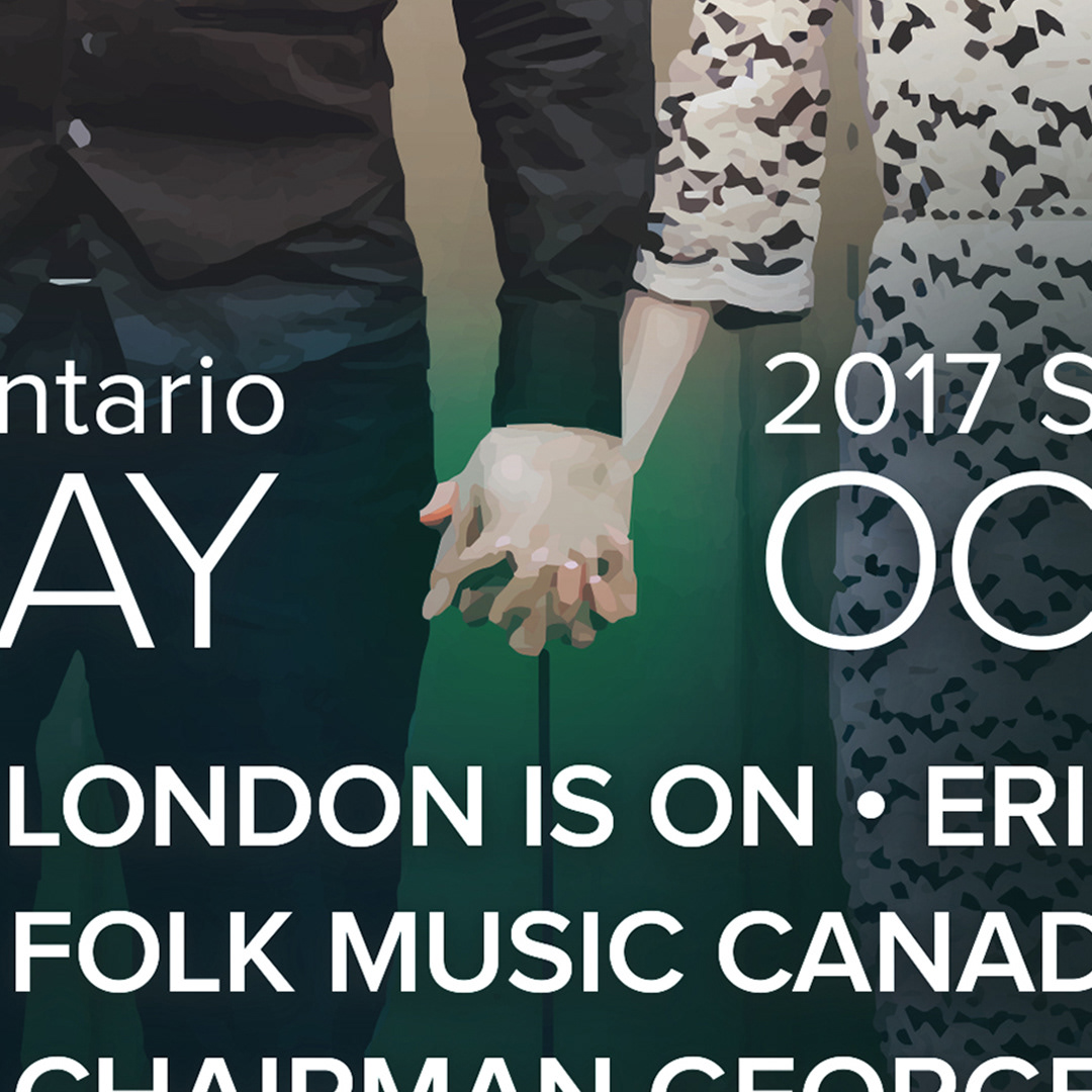
The concept of linked wedding bands gave us a framework to highlight the husband & wife duo in their iconic album-cover photograph, while also providing 2 large solid fields of complimentary colour to draw people in from a distance and stand out amongst all the noise. It also provided a loose but workable grid within which the detailed information could comfortably live. The 'icing-on-the-cake' is a little lyrical payoff for the reader once they are near - an elegant script provided a thin ribbon with which to bind together the fields of colour.